
Fontlu: The Font Workflow Tool Designers Keep (2026 Guide)
You look at one brand and something about it just feels right – trustworthy, put-together – and you look at another and can’t quite name what’s off, but something is. Nine times out of ten, that’s the font talking. This is exactly the problem Fontlu was built to solve. Pick well and readability goes up, trust goes up, the whole identity just clicks.
That’s more or less the whole case for Fontlu, which has been coming up a lot lately among designers who are sick of juggling five browser tabs just to test one headline.
Old-school font sites are basically glorified download buttons. Grab the file, install it, hope it looks decent. Fontlu is trying to do something a bit different – folding discovery, live previews, and licensing into one place instead of three. Here’s why that actually matters in practice, what it gets right, and what to double-check before you build client work around it. (For more breakdowns like this one, check out our technology coverage.)
Quick answer
Fontlu is a font-discovery and workflow platform that combines browsing, live text preview, licensing info, and export into a single tool – instead of the usual routine of downloading files blind, testing them separately, then hunting down licensing terms after the fact.
What it actually is
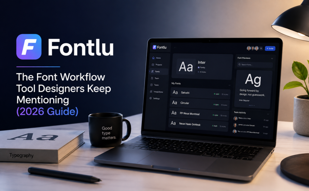
Think of it less as a font library and more as a workspace. Management, previews, discovery – all under one roof. Instead of downloading twenty fonts just to see how they behave, you preview and compare right there, before committing to anything. Sounds small, but it adds up once you’re a few projects deep and tired of the same routine.
It’s not purely about speed either. There’s the boring-but-necessary stuff too – organizing collections, checking licenses, testing styles without breaking your flow mid-project. Say you’re freelancing a logo. Rather than judging a font off some generic “quick brown fox” placeholder, you punch in the actual client name and see how it really reads.
How it fits into a normal design day
Design work moves fast, and there’s rarely room to trade speed for quality – you need both at once, which is annoying when you think about it. Fontlu tries to close that gap by putting the library, real-time preview, and search in one interface, so less time goes to hunting and more to actually refining the layout.
Say you’re building the branding for a new coffee shop. Instead of bouncing between apps to test headline fonts, you preview them right there, nudge the spacing, compare a few options side by side. Keeps things consistent, and cuts down those last-minute “wait, can we try a different font” moments right before a client call.
Features worth knowing
The biggest strength is honestly just how much gets bundled together. Browse thousands of fonts, filter by style, preview instantly, check licensing – none of it requires leaving the workspace. That’s what makes it feel less like three separate tools glued together with duct tape.
Fontlu handles the formats you’d actually need – OTF, TTF, WOFF – so moving between print, web, and mobile doesn’t turn into a formatting mess. Some newer platforms in this space, this one included, are also leaning into AI-assisted pairing suggestions based on readability and brand tone. Not a replacement for taste, but a decent shortcut when you’re staring at a blank page and nothing’s coming.
Choosing the right font
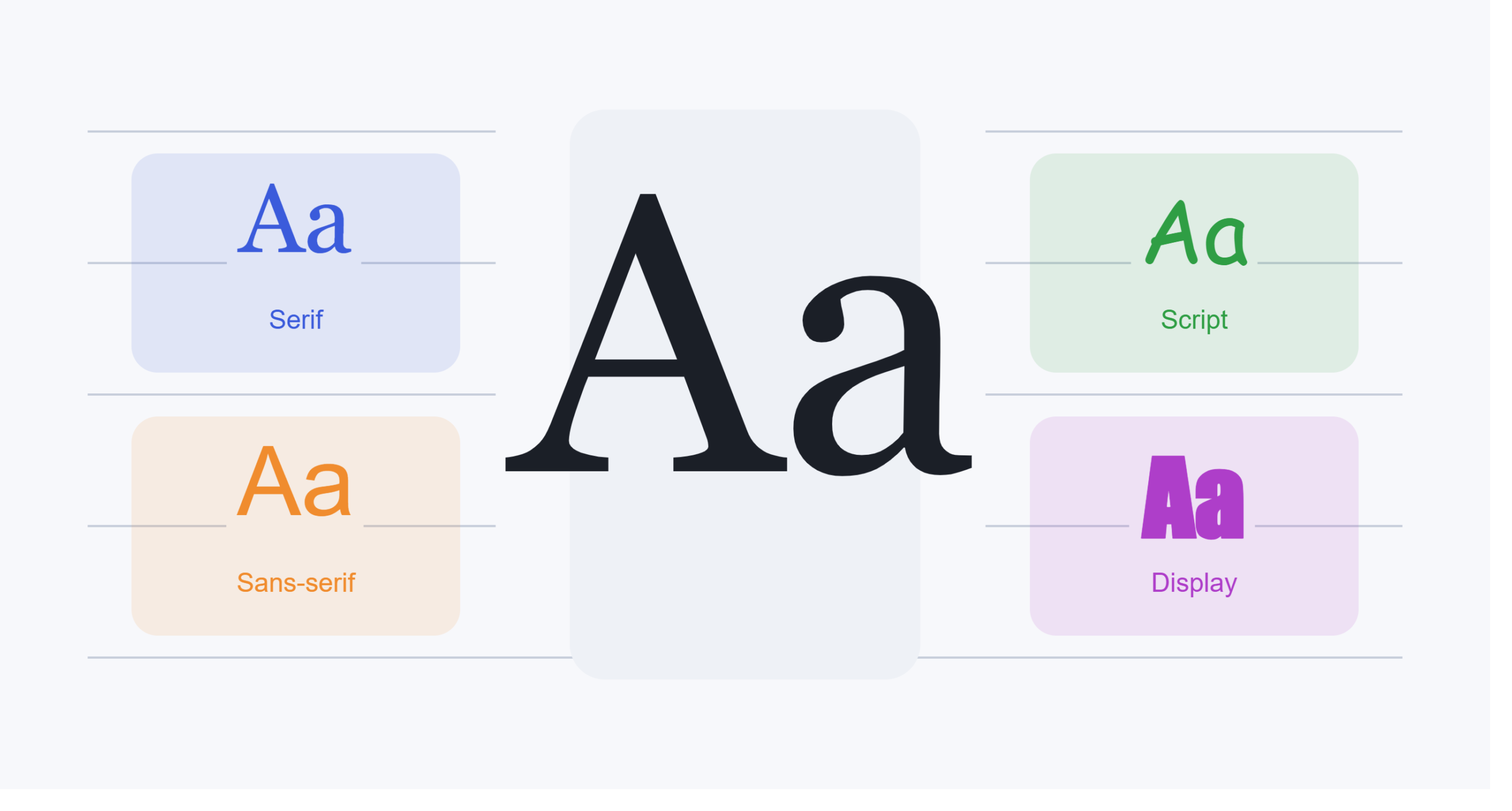
The “right” font depends on who you’re talking to and what you’re actually trying to say. Serif tends to read as trustworthy, a bit traditional. Sans-serif leans cleaner, more modern – probably why so many apps default to it without a second thought. Not a hard rule, just a decent starting point.
Context still beats any rule of thumb. A luxury fashion label probably wants something elegant and serif-heavy. A tech startup usually leans minimal, sans-serif, no fuss. Live preview tools make it easy to just try both and see what actually feels right instead of guessing and hoping.
Font pairing, without just guessing
One font rarely carries the whole design alone. Pairing something bold for headlines with something quieter for body text builds hierarchy – it tells the eye where to go first without the reader ever noticing they’re being guided.
Restraint matters here too. Two or three well-picked typefaces will beat five decorative ones fighting each other, every time. Most experienced designers stick to this because it keeps things looking intentional rather than like a ransom note pasted together in a hurry.
How it compares to the usual names
| Feature | Fontlu | Google Fonts | Adobe Fonts | DaFont |
|---|---|---|---|---|
| Live font preview | Yes | Limited | Yes | Limited |
| Smart search filters | Yes | Basic | Moderate | Basic |
| Commercial license info | Yes | Yes | Yes | Varies |
| Font pairing support | Yes | Limited | Moderate | No |
| Multiple font formats | Yes | Limited | Yes | Yes |
| Best for | Creative workflows | Websites | Adobe users | Free downloads |
Every platform here has its own lane. Google Fonts is free and web-first. Adobe Fonts plugs straight into Creative Cloud if that’s already your world. DaFont is more of a giant free-for-all bin – sort by chaos. Fontlu is trying to sit somewhere else entirely, combining discovery, previews, and organization into one workflow instead of just being a place to grab a download.
Which one actually fits depends on what you’re doing. Branding work usually needs clear licensing and solid previews. Web developers care more about performance and compatibility.
Typography mistakes it helps catch
A lot of bad design isn’t a graphics problem – it’s a type problem, plain and simple. Too many fonts stuffed into one layout, spacing nobody double-checked, a typeface that looked great in the mockup and falls apart at ten points. Live previews catch a chunk of this before it ever ships, which sounds minor until you’ve actually shipped something broken.
| Common mistake | Better move |
|---|---|
| Using too many fonts | Stick to two or three that actually get along |
| Ignoring readability | Test at different screen sizes, not just your monitor |
| Poor font pairing | Mix serif and sans-serif on purpose, not randomly |
| Bad spacing | Adjust kerning, tracking, line height by feel |
| Skipping licensing | Confirm commercial rights before it touches client work |
| Chasing trends only | Balance what’s trendy against what’s actually readable |
Licensing is the other quiet trap people fall into. Using a font commercially without the right rights can turn into a real legal mess for an agency – not hypothetical; it happens more than people think. Checking the license before downloading isn’t exciting work, but it saves everyone a headache later.
Accessibility, not just aesthetics
It’s easy to think about typography purely as looks, but readability is just as much about who can actually use your design in the first place. Low-contrast text, overly decorative fonts, type that’s too tiny on a phone screen – all of that quietly shuts out a chunk of your audience before they’ve read a single word.
Fontlu’s live previews genuinely help here. You can test how a font holds up at different sizes and against different backgrounds before it ever goes live, which beats catching “this is unreadable on mobile” after the client’s already approved it.
Print vs. digital
Fonts don’t behave the same on paper as they do on a screen, and that trips people up more than you’d think. A typeface that looks sharp and elegant on a printed business card can feel cramped and hard to read shrunk down on a phone. Having OTF, TTF, and WOFF all in one place means you’re not stuck reformatting or hunting for a different file type mid-project.
Print tends to reward a bit more character in a typeface, since paper texture and resolution forgive small details that’d get lost or turn muddy on a cheap screen. Digital rewards clarity and restraint instead, since screens vary wildly in size and quality from one device to the next. Testing a font across both before locking it in saves a lot of back-and-forth later.
For teams and agencies
Solo work is one thing. Typography gets messy fast once more than one person’s involved. An agency juggling ten client accounts can’t have everyone picking whatever font looks nice that morning – brand consistency falls apart without some shared system holding it together. This is exactly where Fontlu earns its keep beyond just personal convenience.
Shared collections mean the whole team pulls from the same approved set instead of five designers quietly downloading five slightly-different “close enough” fonts from random corners of the internet. Licensing gets easier to track too, since it’s centralized instead of scattered across downloads folders nobody remembers to check. New hires or freelancers brought on for one project don’t have to spend their first week hunting down the “right” fonts buried in an old email thread nobody can find anymore.
Where typography is headed
Type keeps shifting alongside the tech around it. AI suggestions, variable fonts that adjust weight and width on the fly, responsive type that reflows depending on screen size – all of it’s changing how these decisions get made day to day. Instead of manually testing a hundred fonts one at a time, tools are starting to suggest combinations based on brand tone, audience, and accessibility needs upfront.
None of this replaces actually having an eye for type, to be clear. A tool can suggest a pairing, but it can’t tell you it feels wrong for the brand – that part’s still on the designer. What these platforms do is cut out the tedious middle step so there’s more time left for the part that actually needs a human judgment call.
Is it worth trusting?
Trust matters as much as good design when you’re picking a platform to lean on for real work. Licensing clarity, organized collections, and speed tools are all good signs – but that’s not a reason to skip your own homework. Always double-check the license on any font before it lands in commercial or client work, no matter how polished the platform looks on the surface.
A platform worth trusting should be upfront about downloads, keep its library current, and be clear about licensing terms instead of burying them three menus deep. It’s also worth looking for mentions of the platform beyond its own marketing pages – a quick outside check before you build a client deliverable on top of any newer tool.
This kind of due diligence matters for any newer platform, not just font tools – we’ve walked through the same process for other emerging names, like our Seekde review and Sosoactive breakdown.
FAQ
Is Fontlu free? Most typography platforms mix free and paid tiers. Always check the license on a specific font before downloading – personal and commercial use rights aren’t the same thing, and assuming otherwise is exactly how mistakes happen.
Can I use the fonts commercially? Depends entirely on that specific font’s license. Some are cleared for business use right away; others need a separate commercial license purchased first. Check before it goes anywhere near a logo, an ad, or something for sale.
Is it good for beginners? Yeah, genuinely. Live previews and organized categories make the learning curve pretty forgiving. It’s not just for beginners, either – experienced designers get plenty out of the workflow tools too.
How is it different from Google Fonts? Google Fonts is essentially an open-source library built for the web, full stop. This covers more ground – discovery, previews, organization, and licensing guidance, all under one workflow instead of just being a repository you download from.
Who benefits most from it? Graphic designers, web developers, UI/UX folks, branding agencies, marketers, students, and content creators – basically anyone who deals with fonts often enough to want less friction doing it.
Final word
Typography quietly shapes how people feel about every website, ad, logo, and product they run into. It’s never just decoration – fonts carry credibility, readability, and brand identity all at once, which is why designers keep hunting for smarter tools instead of settling for the same clunky routine.
Whether you’re building a brand from scratch, putting together marketing material, or just trying to make a website feel a bit more polished, understanding the basics of type pays off eventually. The best font isn’t the trendiest one on the list – it’s the one that actually gets the message across and sticks with someone after they’ve looked away.